Market Mindz (Power BI)
The Situation:
Market Mindz is a fictional marketing data by a firm called Market Mindz that specializes in Food and Beverage products. The dataset contains information about marketing strategies, customers, and products. Our goal is to transform their raw data into meaningful insights and recommendations for management. More specifically, we need to:
- Track KPIs (customers, average income, online/in-store purchases, average age etc)
- Track and compare campaign’s performance
- Analyse buyer’s composition
- Purchase drivers
The Data:
We’ve been given a collection of raw data (CSV files), which contain information about products, platform (online, in-store), customers, and campaign data, spanning from the years 2012 to 2014.
The Task: We are tasked with using solely Microsoft Power BI to:
- Connect and transform/shape the data in Power BI’s back-end using Power Query
- Build a relational data model, linking fact and dimension tables
- Create calculated columns
- Design a multi-page interactive dashboard to visualize the data in Power BI’s front-end
The Process:
1. Connecting and Shaping the Data
Firstly, we imported the data into the Power Query editor to transform and clean it. The next process involved:
Removing Duplicates: Duplicate entries were removed from the dataset to ensure accurate analysis.
Handling Null or Missing Values: For some columns, missing values were replaced with defaults or averages. Null values in “key” columns were removed using filters.
Data Type Conversion: Columns were converted to appropriate data types to ensure consistency. Dates were converted to Date type, numerical columns to Decimal or Whole Numbers, and text columns to Text.
Column Splitting and Merging: Several columns were split to separate concatenated information, or merged to create a unified name (such as Customer Full Name).
Standardising Date Formats: All date columns were formatted consistently to facilitate time-based analysis. This step was important for ensuring accurate time-series analysis in Power BI.
Removing Unnecessary Columns: Irrelevant columns were removed to streamline the dataset. This helped focus the analysis on relevant information, reducing memory usage and improving performance.
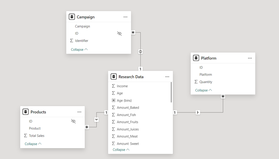
2. Building a Relational Data Model
Secondly, we modeled the data to create a snowflake schema. This process involved creating relationships between the dimension and fact tables, ensuring cardinalities were one-to-many relationships.
Enabling active or inactive relationships, creating hierarchies for fields such as Geography (Continent-Country-Region) and Date (Start of Year-Start of Month-Start of Week-Date), and finally hiding the foreign keys from report view to ease the data analysis and visualization steps and reduce errors.
3. Creating Calculated Columns
In Power Query editor, we created calculated columns such as customer age bins, birth year, amount juices, amount fruit, amount meat etc.
4. Visualising the Data
The final step of the project was creating a multi-page interactive dashboard, including a range of visuals and KPIs that could serve management and lead to informed decision-making. We used several visuals and tools to demonstrate and visualize the data across the 3 report pages, including KPI cards, line and bar charts, matrices, gauge charts, maps, donut charts, and slicers. We made sure the report was fully interactive and simple to navigate, with icons used to enable filters, cancel filters, and guide users to each report page with ease. Features such as drill-through, bookmarks, parameters, and tooltips were also used throughout the dashboard, further enhancing its usefulness and impact on management.
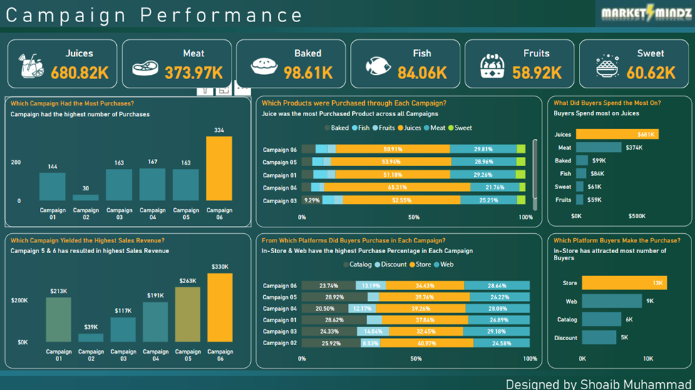
Executive Dashboard: The first report page provides a high-level view of Market Mindz overall performance throughout different campaigns. We used card visuals to present Key Performance Indicators such as overall sales for juices, meat, baked, fish, fruit and sweet products. Using clustered columns charts, stacked bar charts and clustered bar charts to find out campaigns with the most purchases, campaigns with highest revenue, product sales by each campaign, preferred platform in each campaign, revenue by product, and preferred platform by buyers.
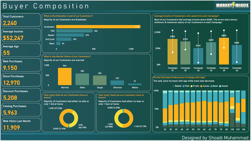
Buyer Composition: The second report page throws a light on buyers’ behavior. It lists Key Performance Indicators like total customers, average income, average age, purchases from different sources like online, in-store etc., and monthly website visits.
To further study about customers, we have used bar chart to list the count of buyers by education level, column chart to visualize average income of customers by each campaign, column chart for count of customers by marital status, donut charts to display whether customers had kids/teens at home and the most interesting chart here is the stacked column chart that visualizes purchase preferences with age.
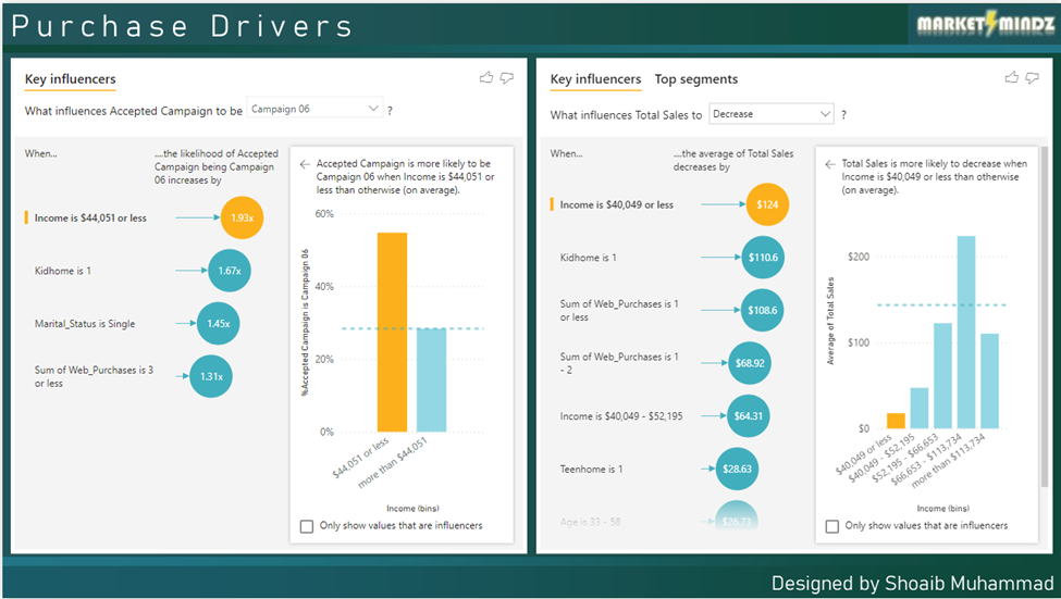
Purchase Drivers: The third report page focuses on finding about what led the buyers to make a purchase. Here we used Key Influencers visual that uses AI to find out keys factors that drive an event.
The first visual shows the key factor that led a customer to become part of a campaign is Income. Others contributing factors are also shown in the visual.
The second visual shows the key factor that contributed in increase or decrease of sales. The visual clearly shows that the main factor that leads to decrease of sales in income below average.